This post is not about layout design samples in making your website so you will not see sample layouts in this blog post. You can see sample templates anyway from hosting platforms on the web.
This is to give you a practical guide on the layout design and the user experience of your first website. But before jumping into this topic, below is what you need to set up to start making your website.
- Domain name and web hosting – click the link HERE to register and buy your first web host and domain. Here’s is our earlier post on how to choose your domain name.
- Basic WordPress knowledge – HERE is a book link of WordPress for Beginners 2020.
Okay, so now you are ready, Here are the basic steps in designing the layout of your website.
Set Clear Objective/s. Would you want customers to buy your products? Would you want them to book your service? The challenge is that the user or the website visitor is the one in charge of the experience. You may have built a site with so many pages, but when the customers come to your website, they may choose to look at just one of them.
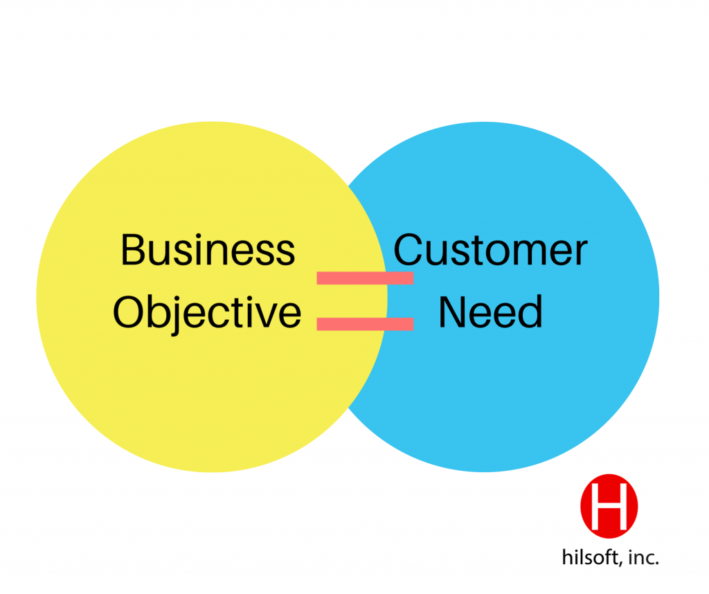
So the first step is to understand what you are trying to achieve and at the same time understand what the user is trying to achieve and then meet in the middle.
You can’t control the web on user experience. Your website visitors are impatient and difficult to please. They scan reading your website, and quickly scan what they are interested in.
So how do you make a better quality webpage? Well again, it depends on your objective. The website navigation depends on your business goals. The simplest example is if you are a service firm, then you would want the visitors to learn more about your services and/or you would also like them to get in touch for the use of your services.
Set Your Priority. The next step after defining your goals is to set the goal “Priority Order”. Going back to the example of a service firm, if your priority is to have your customers get in touch with you, then that should be the first thing they should see in the layout of your website. You may want to emphasize it by making it bolder or large. But if you want them to understand first what you do and who are the people in your firm, then a contact page may go to 3rd priority. Having that clarity of goals will let you make a much more effective website.
Understand the Customer. Now that you have defined your goals and set the priority, then next is to understand and meet the customer need. What are the challenges they are trying to solve, what are their pains and what are they trying to achieve? How can we prove to them that our services are better than competitors? A good tip to map your design to your customer’s goals is to list down the different types of customer profiles based on how much they know about your industry, product or service. Categorize them as “hot”, “warm” and “cold”.
One customer maybe someone who knows nothing about your or your products at all (cold), so one consideration is to make a page about the benefits of your product or service.
Another customer profile is someone who already knows the benefits of the product and so you don’t need to explain it to them, perhaps you may want to lead them directly on how to buy it from you (hot). It is a list of people’s different points of conversion and purchase journey. So this will help you map out the structure of your website and start directing people to your website sections based on their needs.
Focus on Value Proposition What’s so special about you, why should I believe you, how do I trust you? Here is where you define customer testimonial pages, awards and some evidence that shows your value.
Post-It Notes Technique. One technique in defining sections on your website is prepared Post-It notes and ask your customers to write down different sections they would like to see in your website. Then after that, provide them another set of Post-It notes and ask them to fill-out the items that they would love to see on the individual sections.
Metrics. After the first iteration, the next step is to measure the performance of your website. Try signing up with Google Analytics and learn how your audience behaves. You can learn a lot of things from those metrics from acquisition behaviors and their retention and then you can adjust your design accordingly. This is another broad topic to discuss, probably in the next blog posts. Avoid copying existing websites or your competitor’s website because you don’t have their metrics, and you don’t know if their website works for them.
Your website shouldn’t be so complex and crowded. Make it simple and minimal. Unlike the websites during the early 2000s, modern websites now are just a one-pager site to avoid the visitors in thinking where to go and which to read.
As they say, the best user experience is to not make them think.
For questions or more info about this topic, free free to join our NEW FB Group Hilsoft Digital Transformation Community. Be a founding member!

